Infographics and social amplification: law and accounting infographics that rock
May 19, 2016
Infinite Global recently published a joint study with Buzzsumo (a software company providing content analysis to the likes of BuzzFeed, HubSpot, and more).
The study looked at the websites of the top 100 law firms and accounting firms in the United States and analyzed which industry was more successful in garnering social media shares of the content it produced.
(Spoiler alert: accounting firms won).
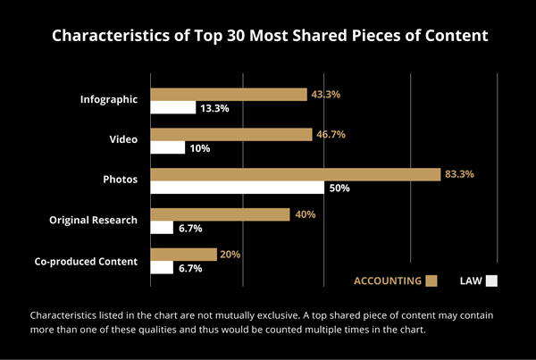
The study also identified the factors that made items of content more likely to be shared, including the addition of an infographic:
In presenting this research during our recent webinar, one participant had a query: “What are examples of law or accounting firm infographics that were shared extensively?”
We thought this was such a great question, we decided to write a blog post on it. What follows are four infographics (three from our study, one from elsewhere), that received a large number of shares, our thoughts as to what made them so successful, and tips for how marketers can create awesome infographics that enhance and attract shares.
The Internet of Things Moves In

This infographic by Deloitte received a whopping 3,900 Facebook shares, 1,700 LinkedIn shares and 5,900 of total social media shares over the last year.
Design
One design-related reason for this infographic’s success: its use of the principle of “visual hierarchy,” a design trick referring to the fact that humans are not equal opportunity ‘see-ers,’ but rather organize what we see and absorb first in terms of visual relationships.
In this particular example, the circles on both sides of the axis force our brains to look for ways to differentiate between them (because we reason they must be related as they are the same size and shape). Our brains seek to organize the information contained in the circles through their color and positioning, and in doing so, our attention is drawn to the stats within the circles and their relationship to the picture – which is the critical information the artist most wants us to absorb.
Influencers
Another reason this infographic performed well … it was shared by influencers (one with 11,200 Twitter followers).
The role of influencers in content amplification should not be underestimated; they can dramatically multiply shares. In a recent study, Buzzsumo found that just one influencer re-tweeting content resulted in 31.8 percent more shares (defining an influencer as someone who is re-tweeted an average of two times).
This underscores the dual-nature of content marketing. Good design is, of course, critical, but fostering relationships with influencers is equally important.
“The 2015 International Arbitration Survey”
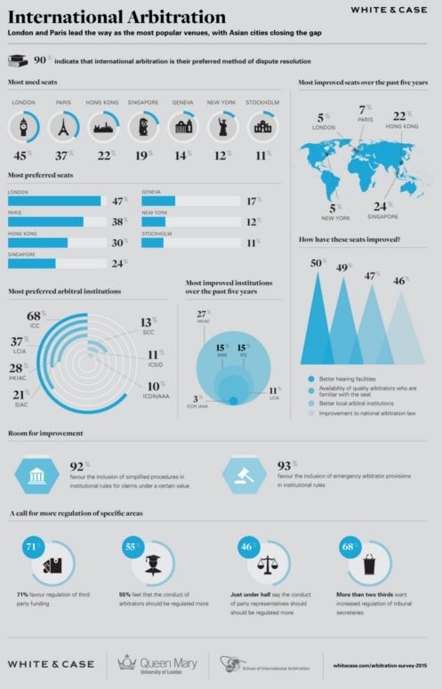
Co-Produced Content
One attribute that made this infographic so successful is the fact that it was co-produced by White & Case and Queen Mary University of London.
Co-producing content is one of the strategies we highlight in the Content Success study as a great way to increase the amplification of any given piece of content.
In partnering with the University and its network (30,000 followers on Twitter and over 3,000 Facebook likes), White & Case’s study received an automatic boost in shares on these social channels. In total this infographic received 947 shares.
Original Research and Content Digestability
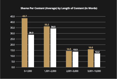
From our content study we know that original data/research – like the arbitration study – receives more shares than non-original. However, there is danger in the marketing of original research for writing to be long and dense, and this is a problem.
Per our study findings, the longer the content (in the professional services context) the fewer shares it receives. In other words, while original research garners great shares, law firms must resist the temptation to produce 10,000 word articles on it, as content length can negatively impact its performance on social media.
This is where infographics can come to the rescue.
The White & Case infographic takes a dense piece of original research and synthesizes it into digestable elements, making the research more shareable than it would be if it were, say, a long-form whitepaper.
“Merger Day At Dentons US and McKenna Long”
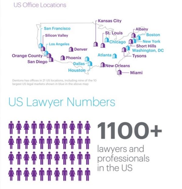
The Value of Graphics in Press Releases
This infographic by Dentons, included in the firm’s merger press release, received 726 LinkedIn shares and a total of 1,000 social shares in the past year.
According to a study conducted by PR Newswire, press releases that leverage visual elements such as a photo or infographic receive an average of 1.4 times more views than text-only releases.
Design
A design tactic employed successfully in this infographic is the “dominance/emphasis” principle, where size is used to steer attention. “1100+” is bold and larger than any other data or text on the page, demanding attention and underscoring the fact that the newly merged firm is a very large operation.
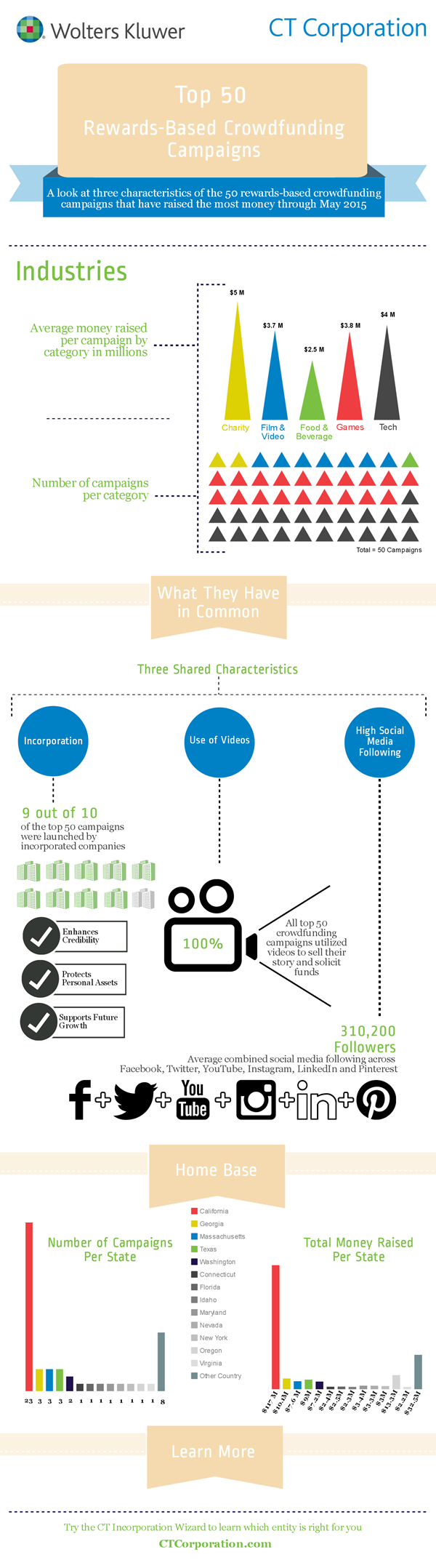
Lessons From the Top 50 Crowdfunding Campaigns
Infographics and PR: A Match Made in Heaven
The fact that graphics and infographics increase social media shares has not been lost on editors.
Augmenting PR pitches with infographics (especially for high profile, high impact projects) can therefore dramatically increase the chance that your article or idea will be published.
Infinite Global created this infographic to augment a study we conducted for our client on the relationship between crowdfunding and incorporation. The resulting piece was accepted for publication by Entrepreneur Magazine and ultimately shared more than 1,600 times over a variety of social media networks.
Key Takeaways
In an era when two million blog posts are published on the web every day (you read that right … every day) eye-catching visuals are key to content amplification, central to getting your content seen.
Infographics are particularly useful when presenting complicated information (which often arises in the context of professional services communications).
Drawing from the samples discussed above, here are key takeaways that can help you create successful infographics:
-
Leverage the science behind design: As a SAGE report notes, the human brain processes visual information 60,000 times faster than text. Infographics are therefore more appealing to the brain and quicker in conveying the same information than words.
-
Devoting time to cultivating relationships with influencers can ensure that your content receives more shares when the time comes to publish it.
-
Consider co-producing your content with another influential party – such as a client, colleague, academic or even competitor – as this will give you an automatic boost in shares.
-
Original research attracts shares, but be careful how the results are presented because content length can impede sharing. For best results, pair your original research with a visual strategy that will ensure the content is presented in a more digestible, shareable format.
Useful links for more reading:
-
http://www.coolinfographics.com/blog/2015/2/3/the-6-principles-of-design.html
-
http://webdesign.tutsplus.com/articles/understanding-visual-hierarchy-in-web-design–webdesign-84 (a design course on “visual hierarchy” techniques)
For more information on the Infinite Global Content Success Study, access a PDF of the report here: www.contentsuccessstudy.com, or contact Helen Bertelli: HelenB@infiniteglobal.com.