Nexus Planning rebrand and website
BRIEF
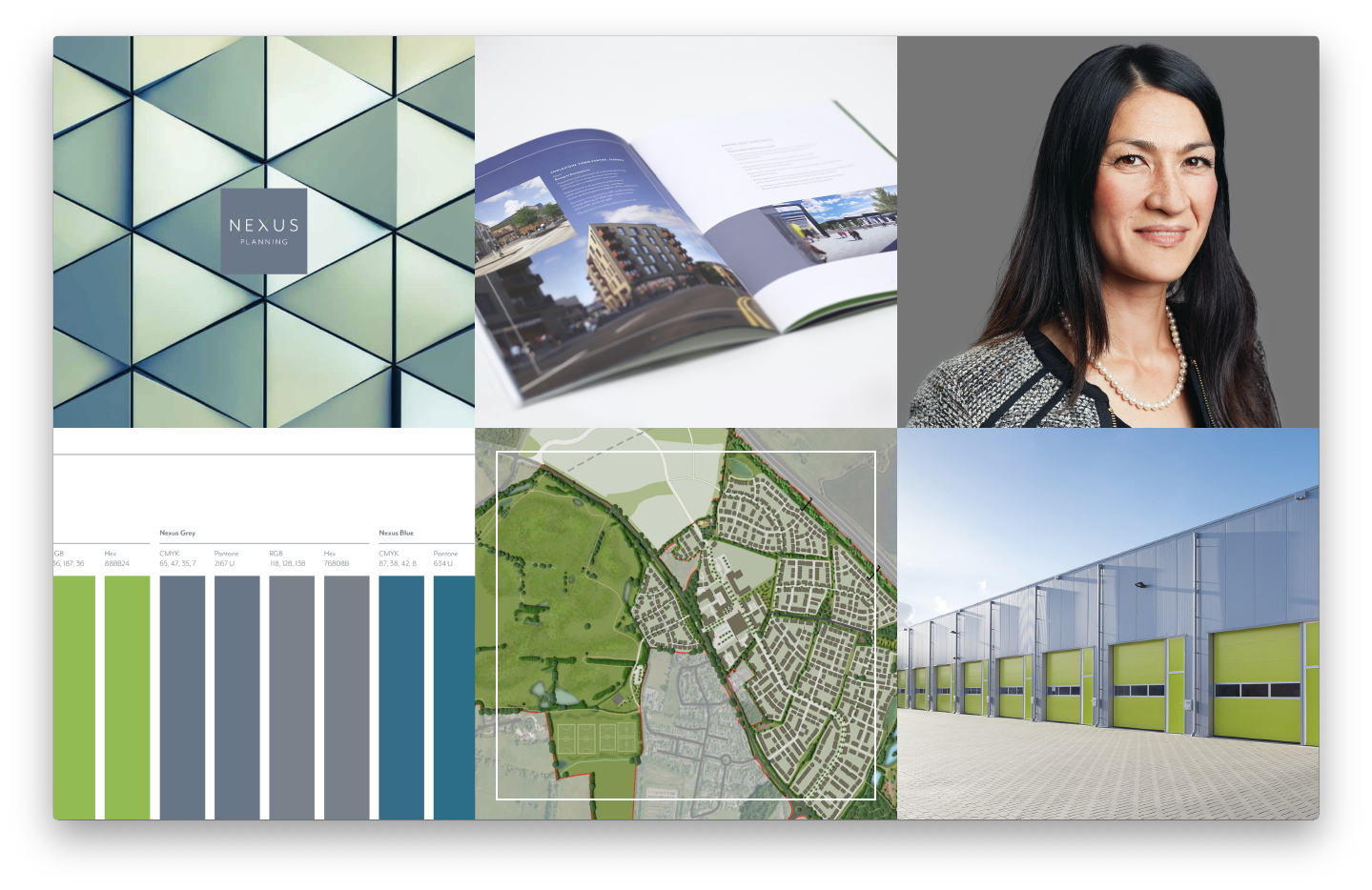
When Nexus Planning approached us, they were at a really exciting juncture; the business and team were growing rapidly and they needed a brand identity which was fit to support their business strategy for the forseeable future. Their identity and logo (therefore overall perception) were still heavily linked to their parent company, so another primary aim was to redefine the Nexus Planning brand in to a strong and independent market position.

APPROACH
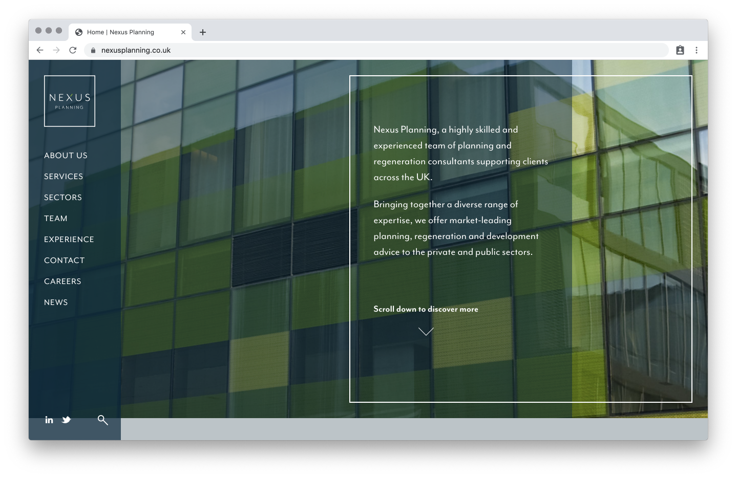
Following our established process, we conducted extensive research and a holistic perceptions audit to establish the reputation that would differentiate them in the minds of their clients – presenting them as the obvious choice irrespective of location and size. After becoming clear was that complete redesign would not make sense for this business, we proceeded to build on existing brand equity (keeping the name and primary color) and deploy a new logo and positioning statement, updated visual identity, a full rollout of stationery, core firm brochure and a contemporary new responsive website that encapsulated and showcased the new brand.
Technical requirements for the site included an interactive case study map at the head of the ‘experience’ page, through which users can filter numerous case studies by geographic region and sector specialism. The recommended and agreed CMS was a very simple but intuitive platform that allows automation between cross-linked components. Due to the amount of news and case study content being published by the firm, an automated cross-link functionality was crucial.

OUTCOME
Whilst it is still early days in the life of this rejuvenated brand, the initial responses have been very positive and feedback is being used to guide the project’s next steps. Aligned with the brand launch, the firm opened their fourth UK office in Birmingham and continues to win and deliver on sought-after projects.


